Components
Make a nav bar, button or card a component, edit its main once and every copy on every page updates. Add instances, variants, hover states and properties.
A component is a part a site uses again and again, such as its nav bar, footer, buttons or product cards. Its main component lives in the site's design system, and each copy on a page is an instance of it. Change the main and every instance on every page follows, while each instance can keep changes of its own.
How components work
- A website Fil makes comes with components for the parts its pages share. The Kinfolk Tea site has Value card, Nav bar, Button, Tea card and Site footer.
- An instance looks and behaves like its main. You can retype and restyle the layers inside it, but not add, remove or move them: its structure is the main's, as in Figma.
- What you change on an instance is kept as its own change, and survives when the main changes.
- In Layers, a main has the component icon and an instance a diamond, both in purple.
Edit a component everywhere
- In the Design tab, click a component on the page, such as a tea card. The inspector's Component section names it and says Instance.
- Click the arrow beside its name (Go to main component). The design system opens beside the page, with the main selected. (Right-clicking an instance has Go to main component too.)
- Change the main as you would any layer: its fill, type, spacing or text. Its Main component section says "Pages that use it update from here".
- Click the back arrow at the top left (Back to Home). The system saves on the way, and every page that uses the component updates to it, each as a new version.
To save and update the pages without leaving, click Save and update all pages in the main's section. A page with unsaved changes of its own isn't updated then; it takes the change the next time you open it.
Make a layer a component
- Select the layer: a whole block, such as a heading with its text, or a card. Name it first if you like, by double-clicking its name in Layers; the component takes its name.
- Click Create component in the top bar (the component icon beside the tools), press ⌥⌘K, or right-click the layer and choose Create component.
- The layer and its styles go into the design system as a main, and the layer becomes its first instance. The message says where it went: "Made Section heading a component in Kinfolk Tea system."
If the page has no design system yet, one is made from the page first. ⌘Z undoes the whole step, main included. A layer that's already an instance, part of a main, or part of the style guide can't become one, and nor can the page itself.
Add an instance to a page
- Select the layer the new one should follow.
- Open Assets › System. Components shows a preview of each.
- Click a component to add an instance after the selected layer, or use its ⋯ menu and Add to the page. Double-click it, or choose Edit main component, to open its main instead.
A component is never added inside another instance. Each main also sits beside the pages on the stage, where right-clicking it gives Insert into the page.
Change one instance
Select an instance to see its Component section:
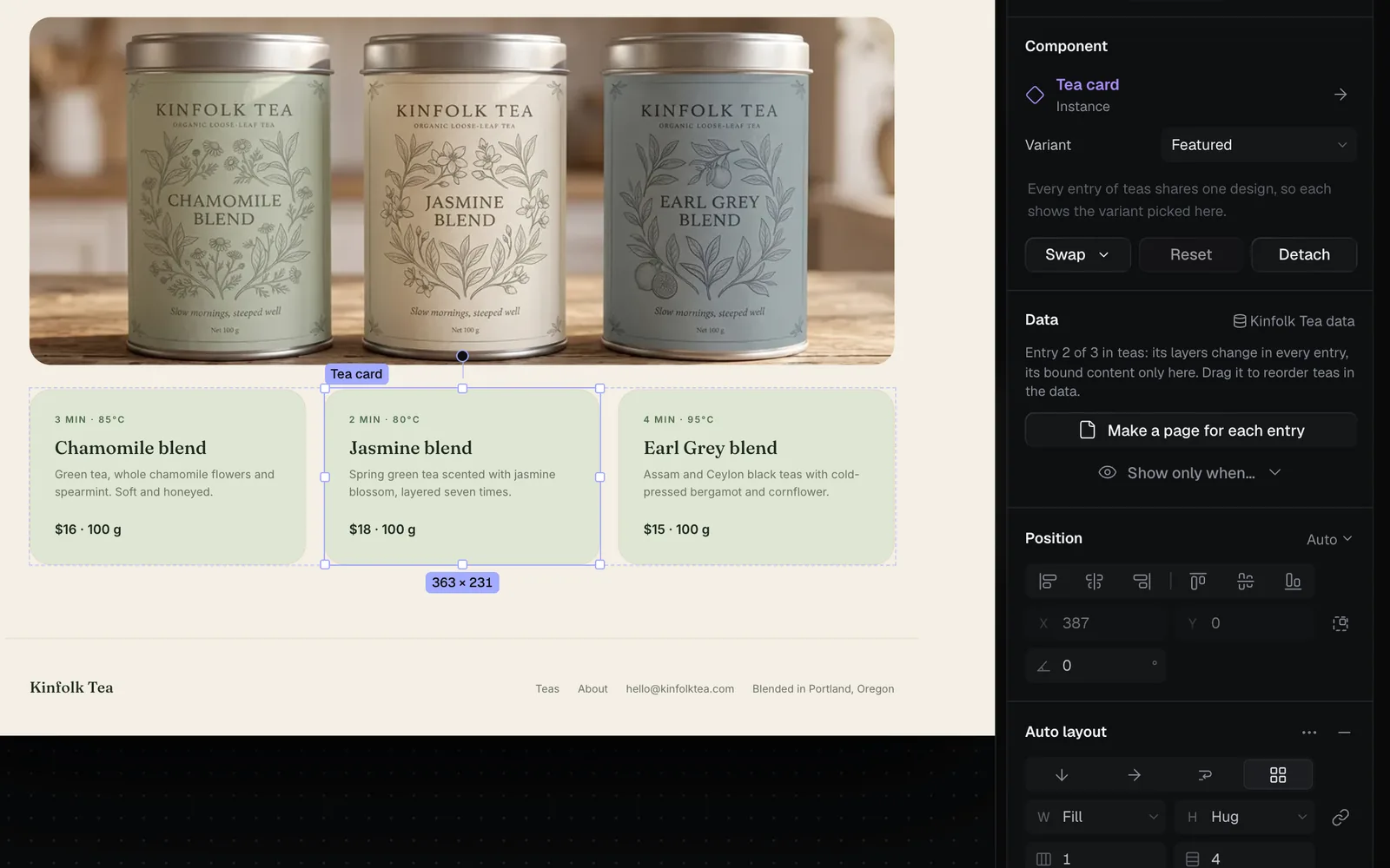
| Control | What it does |
|---|---|
| Variant | Picks one of the main's variants (shown once it has one) |
| Its properties | Its text, picture, link or whether it shows, when the main has them |
| Swap | Replaces it with another component (its own changes don't carry over) |
| Reset | Back to the main, without this instance's own changes |
| Detach | Ordinary layers again, styled as they are (⌥⌘B) |
| Push changes to main component | Makes this instance's own changes the main's, for every instance (shows once it has some) |
A field you've changed on an instance has a mark beside it; right-click it for Reset to main component. Cards that repeat for each entry of the site's data, like these tea cards, share one design: the variant you pick shows on every entry, as the note under it says (see Dynamic websites with data).
Make variants and a hover state
A variant is a copy of the main styled differently, such as a Featured card or a Dark button. A hover state is how the component looks while the pointer is over it.
- Open the main (Go to main component) and click + in its Main component section.
- Choose Variant ("A copy of it to style differently") or Hover state ("How it looks while the pointer is over it").
- The new copy appears beside the main and is selected. Style it, and double-click its name under Variants to rename it.
- Save, then pick the variant for any instance in its Variant menu. Hover states show in Play and on the published site.
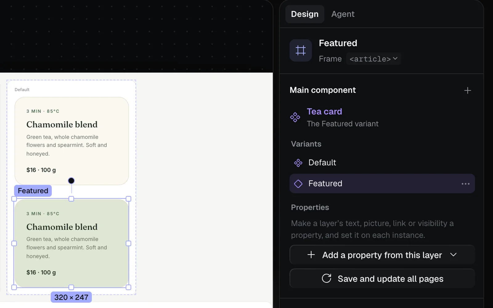
A variant's ⋯ menu has Rename, Duplicate and Delete; deleting one shows the main on the instances that used it.
Add properties
Properties let each instance set its own text, picture, link or visibility from the inspector, without going inside it.
- In the main, select the layer inside it (a title, a picture, a button).
- Click Add a property from this layer and choose Text, Image, Link or Visibility.
- The property shows under Properties; double-click to rename it.
Each instance then shows the property in its Component section: a text or link field, Replace… for a picture, or a switch for whether it shows.
Tips and limits
- To add, remove or move layers inside an instance, edit its main, or Detach it. Trying it on an instance says so.
- Components need the page's canvas: a page opened from the Library has none.
- A component's styles can be up to 80,000 characters; make a smaller part a component if it says it's too big.
- Making, editing and updating components is free.
What's next
- Design systems: the colours, type and spacing components are built from.
- The Design tab: select, type and restyle anything on a page.
- Edit with the agent: ask for a new section that uses the site's components.
- Publish a website: put the site online.