Website hero
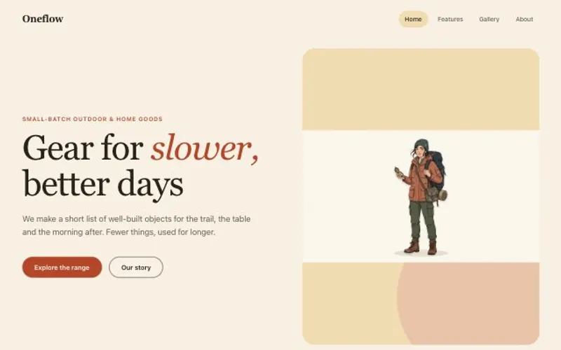
A hero image made for the layout, and the responsive hero section built around it.
Describe your product and its first screen in Hero.md. The hero image is made with room for the headline, and the Code node builds the section around it: nav, headline, button and proof, responsive and ready to paste into your site.
Start this workflowWhat it makes
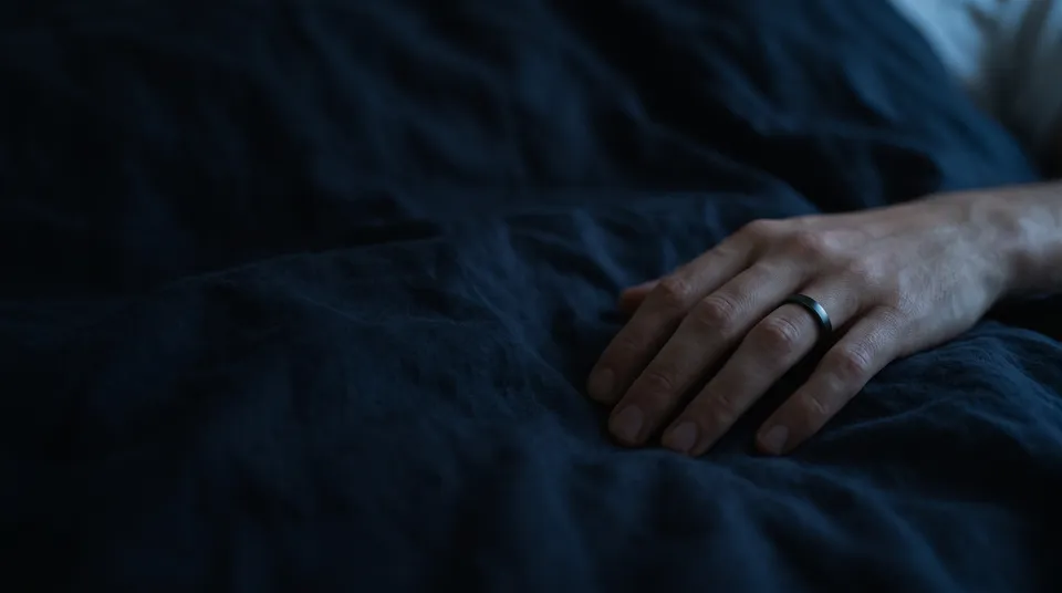
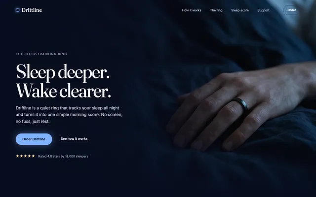
2 things in 2 steps. Every example here was made in Fil with this workflow.
How it starts
- Say what you want“The hero for Driftline, a sleep-tracking ring: dark, calm and premium, the ring in soft night light”, or a picture. Nothing to upload first.
- Pick from a few choicesClaude asks about the headline, the look and what the hero image shows, and tells you if a file is missing.
- Generate allHero image first, then each next step as soon as what it needs is ready.
What you put in
- Design referenceA screenshot of a hero you like.Optional
- Product photoYour product, for the hero image to show exactly.Optional
- LogoYour logo for the nav.Optional
- Hero.mdThe product, the words, the proof and the look. Claude fills it in from your answers, or you can.Brief
Nothing has to be uploaded to start: the canvas opens with a place for each file, ready when you are.
How it runs
Generate all runs it left to right: each step starts as soon as what feeds it is ready, and you see the whole price first. Or run any step yourself.
Step by step on the canvas
- Generate Hero image and pick the take with the calmest space for the words.
- Generate Hero section, then open it to see it at every width.
Skill
The craft every step follows, written out. It comes with the workflow, and you can change it on the canvas.
Read the skill
Website hero
Read first
Hero.md for the product, the words, the proof and the look; the design reference, product photo and logo wired in.
Hero image (16:9)
- Made for the layout: the subject on the right third (unless Hero.md says otherwise), and a calm, empty area on the left where the headline will sit.
- The product is the hero: in sharp focus, recognisable for what it is, caught by the accent light from Hero.md, never lost in shadow. One subject, one light, the palette from Hero.md; a product photo wired in is kept exactly as it is.
- No words, logos or interface in the picture.
The section
- One HTML file: a slim nav (the logo or name, three or four links, one button), then the hero filling the first screen (100svh, at least 640 px tall), with semantic markup, styles scoped under one root class and CSS custom properties.
- A headline of at most eight words saying what it is and for whom, a subline of one or two sentences, one primary button and one quiet secondary link, and the proof from Hero.md under them when it gives a real one (never a placeholder or a note).
- The wired hero image large: behind the words with a scrim on their side, or beside them; it covers its box without stretching, positioned so the subject stays in view at every width.
- Type with presence: the headline at 56 to 88 px on desktop (clamp()), tight leading, at most two typefaces, and the accent colour on the button only.
- A gentle entrance: the words rise and fade in over 600 ms, staggered, and stay put with prefers-reduced-motion.
- Responsive from 360 px: on phones the nav becomes a menu button, the image sits above or behind the words with a scrim, and the button is full width.
Avoid
Lorem ipsum, more than one primary button, centred walls of text, stock-photo clichés, words over a busy part of the picture, a hero shorter than the screen, and made-up customer logos.
Wired into 2 steps on the canvas, where you can change it.
More workflows
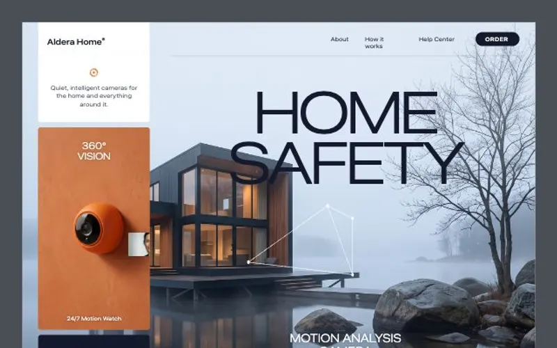 React websiteA React site from your brief, with a hero image and section pictures made for it.About 4 minutes
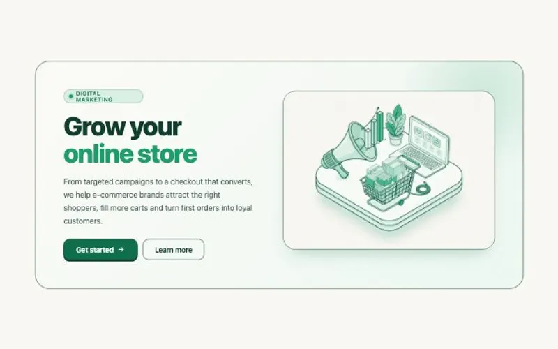 HTML componentOne self-contained UI component from your spec, with an illustration made for it.About 2 minutes
 Website with a CMSPages that read from content you can edit, with one shared design system.About 5 minutes