HTML component
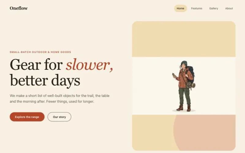
One self-contained UI component from your spec, with an illustration made for it.
Describe a component once in Spec.md. An illustration is made for it, and the Code node builds a single HTML file with scoped styles and CSS variables that you can preview, edit and paste into any site.
Start this workflowWhat it makes


2 things in 2 steps. Every example here was made in Fil with this workflow.
How it starts
- Say what you want“A hero banner for a service that grows online stores”, or a picture. Nothing to upload first.
- Pick from a few choicesClaude asks about what the component says, its look and the illustration, and tells you if a file is missing.
- Generate allIllustration first, then each next step as soon as what it needs is ready.
What you put in
- ReferenceA screenshot of a component you like.Optional
- Spec.mdWhat it is, its words, buttons and look. Claude fills it in from your answers, or you can.Brief
Nothing has to be uploaded to start: the canvas opens with a place for each file, ready when you are.
How it runs
Generate all runs it left to right: each step starts as soon as what feeds it is ready, and you see the whole price first. Or run any step yourself.
Step by step on the canvas
- Generate Illustration and pick the take you like.
- Generate Component, then open it to preview it at every width.
Skill
The craft every step follows, written out. It comes with the workflow, and you can change it on the canvas.
Read the skill
HTML component
Read first
Spec.md for what the component is, its content, its states and its look; the reference and illustration wired in.
Build
- One HTML file: semantic markup, a <style> block and, only if needed, a small <script>. No frameworks or external files except web fonts.
- Everything scoped under one root class, so it can be pasted anywhere without clashing.
- Colours, radii and spacing as CSS custom properties on the root, so it's easy to restyle.
- Responsive from 320 px to full width, with the layout changing at one breakpoint at most.
- Hover, focus-visible and active states for everything clickable; a respectful prefers-reduced-motion.
- The wired illustration shown whole, with rounded corners where it sits on a card.
Look
- One type scale (e.g. 48 / 20 / 15) and one accent colour from the spec, for the primary action only.
- Spacing on a 4 or 8 px grid, generous inside the component; a radius and border that match the reference.
- The illustration large and given room, beside or above the words, never squeezed into a corner.
Copy
Real words from the spec, short and specific. One primary action.
Avoid
Lorem ipsum, fixed widths that break on phones, inline styles everywhere, and animation that never stops.
Wired into 1 step on the canvas, where you can change it.
More workflows
 React websiteA React site from your brief, with a hero image and section pictures made for it.About 4 minutes
 Website with a CMSPages that read from content you can edit, with one shared design system.About 5 minutes
 Website heroA hero image made for the layout, and the responsive hero section built around it.About 2 minutes