Visual explainer
A topic or a document as one rich page: the answer first, then a diagram, the steps and the numbers.
Say what to explain, or paste a document into Topic.md. The visual explainer skill turns it into one page anyone can follow in two minutes: the answer in plain words, a diagram of the whole system, the steps in order, a comparison and the numbers that matter.
Start this workflowWhat it makes

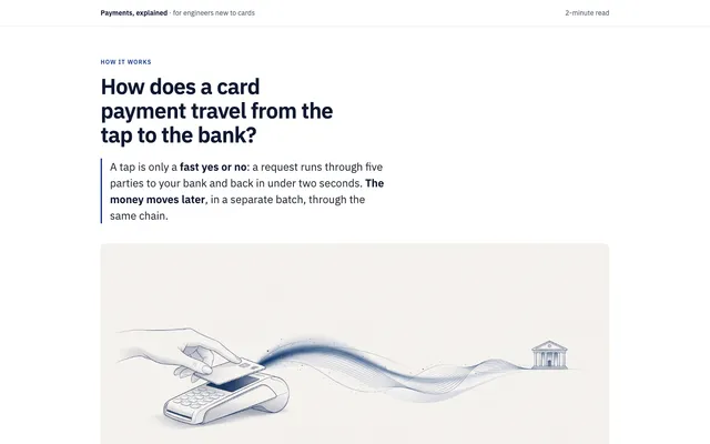
2 things in 2 steps. Every example here was made in Fil with this workflow.
How it starts
- Say what you want“How a card payment travels from the tap to the bank, for engineers new to payments”, or a picture. Nothing to upload first.
- Pick from a few choicesClaude asks about who it’s for, what they should come away knowing and the look, and tells you if a file is missing.
- Generate allCover picture first, then each next step as soon as what it needs is ready.
What you put in
- Diagram or screenshotA sketch, screenshot or diagram of what to explain, if you have one.Optional
- Topic.mdThe question, who it’s for, the parts, the steps and the numbers. Claude fills it in from your answers, or you can.Brief
Nothing has to be uploaded to start: the canvas opens with a place for each file, ready when you are.
How it runs
Generate all runs it left to right: each step starts as soon as what feeds it is ready, and you see the whole price first. Or run any step yourself.
Step by step on the canvas
- Generate Cover picture.
- Generate Explainer: the page reads Topic.md and the cover, then open it to read it full size.
Skill
The craft every step follows, written out. It comes with the workflow, and you can change it on the canvas.
Read the skill
Visual explainer
Read first
Topic.md for the question, who it's for, what they should understand, the parts, the steps, the comparison and the numbers; the cover picture and anything else wired in.
The page, in order
- The answer first: the question as the title, the answer in one or two plain sentences, and the wired cover picture.
- The big picture: one diagram of the whole system in inline SVG, the parts as labelled boxes, arrows for what flows between them, each arrow labelled with what moves (money, data, a request). Nine boxes at most.
- Step by step: the steps from Topic.md as a numbered flow (a vertical timeline, or cards joined by arrows), each with a short title, one or two sentences and the part it happens in, in that part's colour from the diagram.
- Compared: a table or side-by-side cards for the comparison in Topic.md.
- The numbers: three or four key figures from Topic.md as large stats with one line each.
- Words to know: each term the page uses, in one line.
- A recap in one short paragraph, and where to read more if Topic.md has sources.
Diagrams
- Built by hand in inline SVG, never pictures of text or external libraries: rounded boxes sized to their labels (no label runs past its box), clear arrowheads, labels in the page's font at a readable size, one colour per kind of part, used the same way in every diagram and step.
- One idea per diagram, read left to right on wide screens and top to bottom under 700 px (the same boxes, stacked), with no crossing arrows and nothing cut off.
- Hovering or tapping a part highlights it and its steps, with a small script; everything reads without it.
Look
- Calm and editorial: one typeface family, a clear scale (44 / 26 / 17), lines under 70 characters, generous space, a light background with Topic.md's accent colour (or dark if it asks), and parts told apart by tints of that one colour and by their labels, not by new colours.
- Responsive from 360 px wide: a diagram scales down or scrolls sideways inside its own box, never shrinking its labels below 12 px.
- Real headings, a title and description in each SVG, and colour never the only way two things are told apart.
Words
Short, plain sentences for the reader in Topic.md, an analogy where it helps, and every fact from Topic.md: nothing made up.
Avoid
Walls of text, diagrams that decorate instead of explain, more than nine boxes in one diagram, invented numbers, unexplained jargon, and stock imagery.
Wired into 1 step on the canvas, where you can change it.
More workflows
 React websiteA React site from your brief, with a hero image and section pictures made for it.About 4 minutes
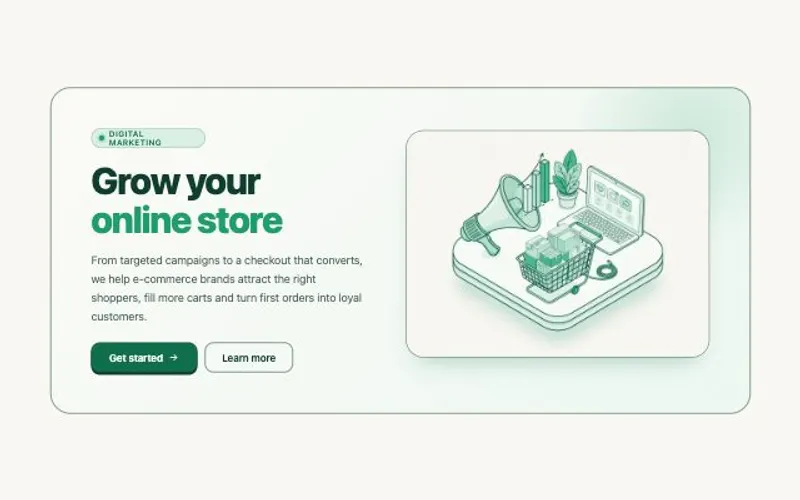 HTML componentOne self-contained UI component from your spec, with an illustration made for it.About 2 minutes
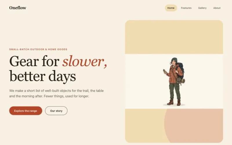 Website with a CMSPages that read from content you can edit, with one shared design system.About 5 minutes