Landing page
A landing page planned for your kind of site, with a picture made for every section from the hero to the footer.
Say what the page is for. Claude plans its sections for your kind of site in Page.md, five to seven from the hero to the footer. A picture is made for every section in the Hero’s look, and the page is built around them, to preview, edit in the Design tab or publish.
Start this workflowWhat it makes
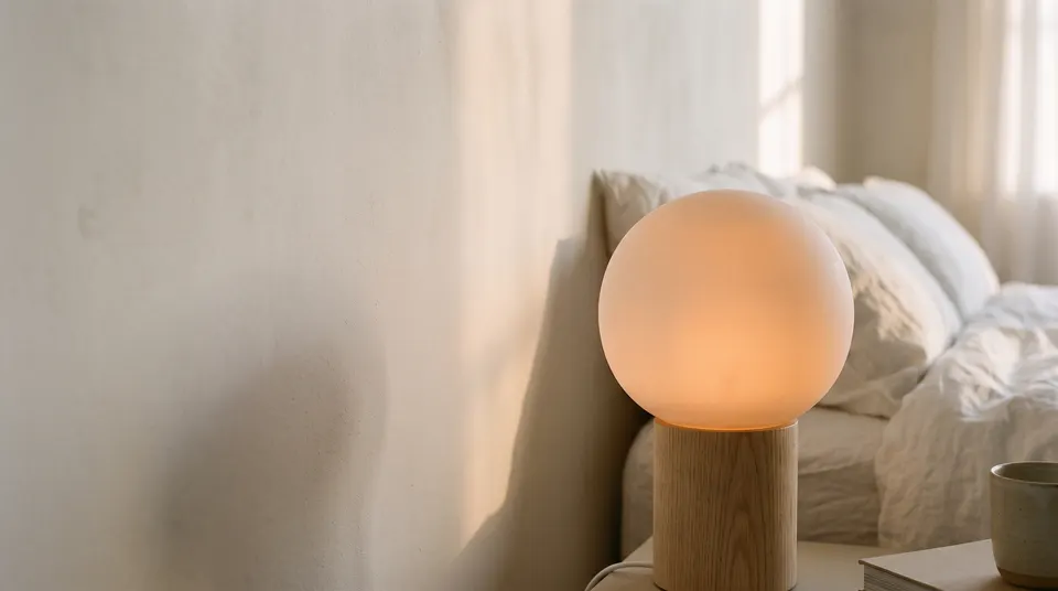

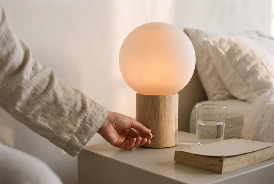
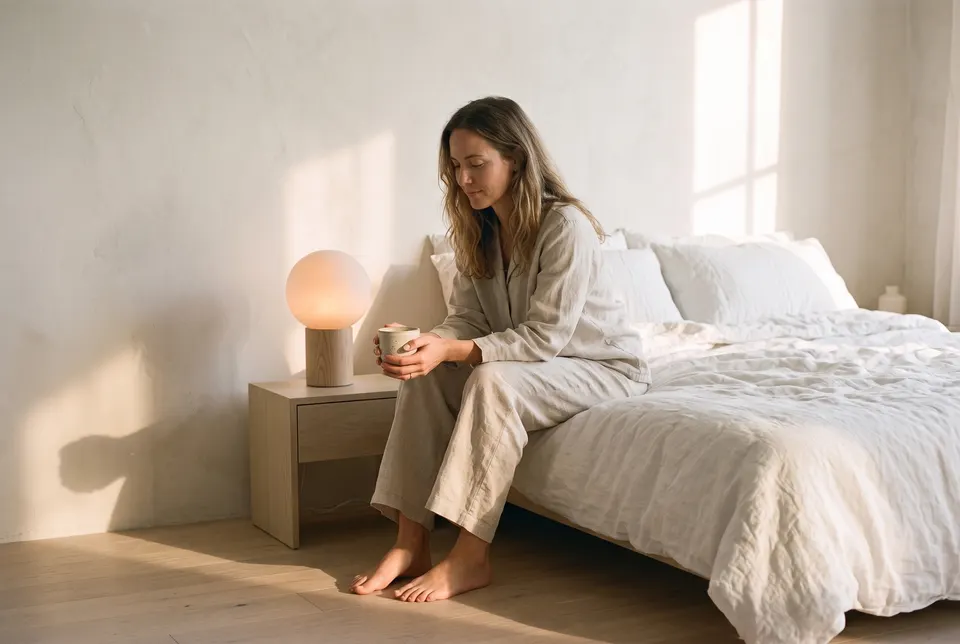
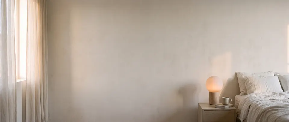
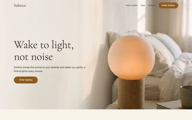
6 things in 3 steps. Every example here was made in Fil with this workflow.
How it starts
- Say what you want“A landing page for Solstice, a sunrise alarm lamp that wakes you gently with light”, or a picture. Nothing to upload first.
- Pick from a few choicesClaude asks about what the page offers, who it’s for and how its pictures look, and tells you if a file is missing.
- Generate allHero first, then each next step as soon as what it needs is ready.
What you put in
- Style referenceA picture whose look every section’s picture follows.Optional
- Or start from one of these styles, picked for this workflow:
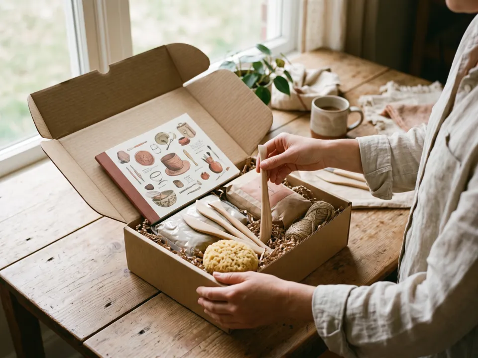 Natural light
 Golden hour
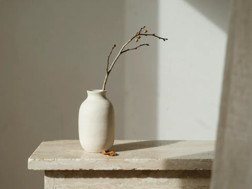 Quiet still life
 Soft gradient
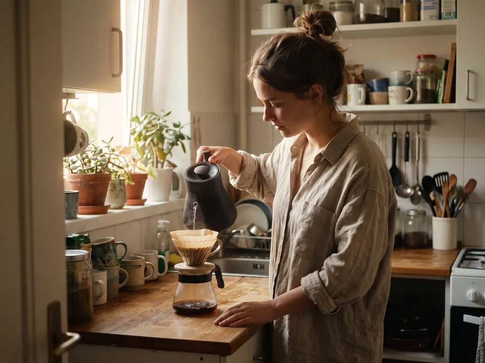 35mm film
 Liquid glass
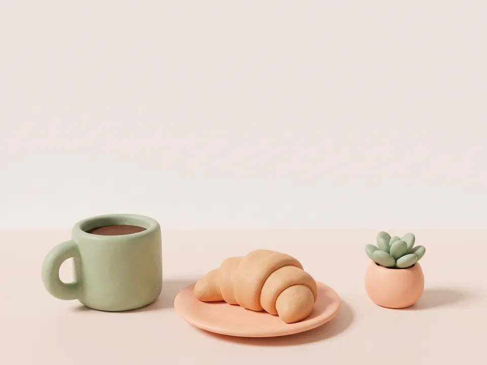 Clay render
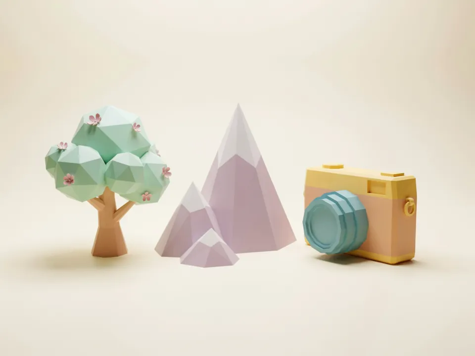 Soft 3D
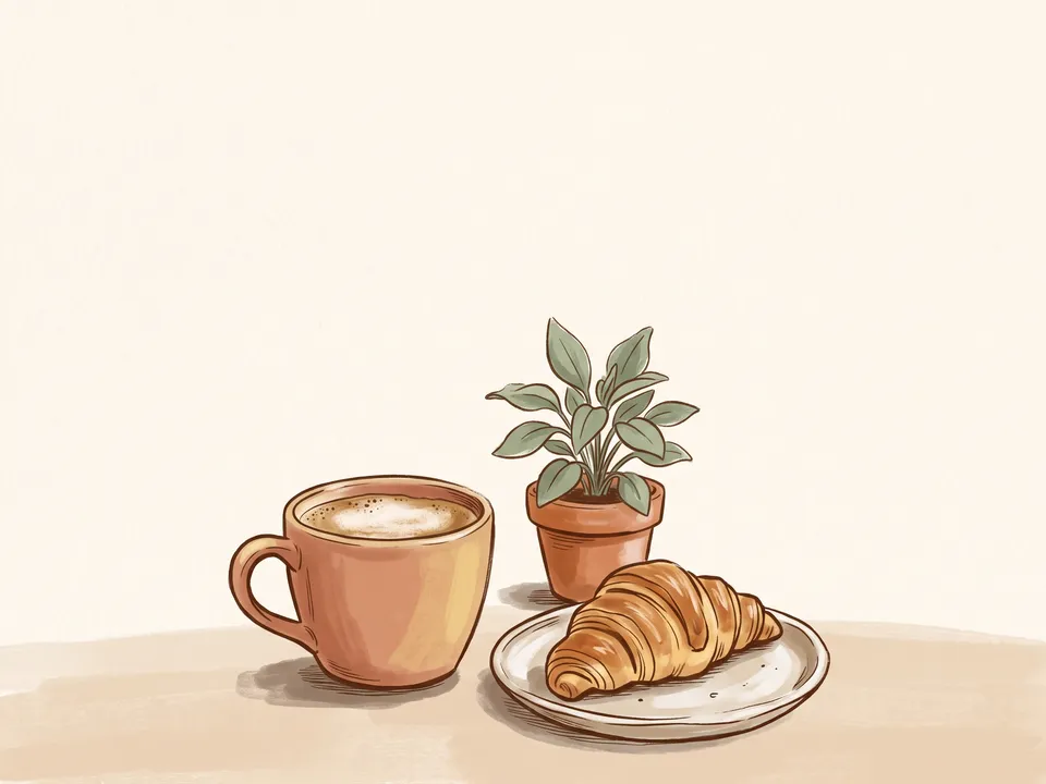 Warm editorial
 Grain gradient
- Product photoA photo of what you sell, kept exactly in the pictures that show it.Optional
- LogoYour logo, for the nav and the footer.Optional
- Page.mdWhat it’s for, the look and each section. Claude fills it in from your answers, or you can.Brief
Nothing has to be uploaded to start: the canvas opens with a place for each file, ready when you are.
How it runs
Generate all runs it left to right: each step starts as soon as what feeds it is ready, and you see the whole price first. From your idea, Claude plans 5 to 7 sections, and adds a step for each one past the 5 it comes with. Or run any step yourself.
Step by step on the canvas
- Generate Hero: it sets the look of every picture.
- Generate Section 2 to Section 4 and Footer: each follows the Hero, and Claude checks each one.
- Generate Landing page to build it around them. Add sections makes it longer.
Skill
The craft every step follows, written out. It comes with the workflow, and you can change it on the canvas.
Read the skill
Landing page
Read first
Page.md for the product, who it's for, the kind of site, the promise, the button, the voice, the look and every section's words and picture; the style reference, product photo and logo wired in.
The sections
- The hero first and the footer last, and between them three to five sections planned for the kind of site, for example:
- An app or software: the problem it ends, how it works, the features at work, a customer's story, pricing.
- A product to buy: the product up close, in use, what it's made of, reviews.
- A local business: what's on offer, the place, the people, visiting (hours and address).
- An event: why come, the line-up, the programme, the venue and tickets.
- A course, book or service: what you get, inside it, who's behind it, results.
- Each answers the next question a visitor has, in order: what is it, why should I care, how does it work, can I trust it, what does it cost, what now. The footer closes it (the last call to action with Page.md's offer, where to buy or find you), so it's never a section of its own as well.
- Proof (numbers, ratings, quotes, press) only as Page.md gives it. A section with nothing real to show (reviews without real reviews) is left out, never kept as a placeholder: every section has its own words and its own picture.
A picture for every section, in one look
- The Hero sets the look: every other picture keeps its palette, lens or medium and finish, as if from one shoot or one illustrator, while its light follows its own section's moment (asleep before dawn, the evening before) as Page.md says. A style reference wired in sets that look, and Page.md's Look its colours.
- Someone in more than one picture is the same person each time, as Page.md's People describes them (face, hair, build, clothes), and the product and its setting stay as they are (the same table, the same room).
- Each picture shows its own section's point, so you could tell its section from the picture alone (what it's made of shows the materials up close; in use, the person using it at that moment), and as a new picture: the product may come back, as another part, use or detail, never the same shot of it.
- Hero (16:9): the product or the promise, large and in sharp focus on one side, with calm, empty space on the other for the headline.
- Sections (3:2): shown whole beside or above their words, never under them, so the subject can fill the frame. A product photo wired in is shown exactly as it is wherever a section shows the product.
- Footer (21:9): a wide, calm, light closing picture that isn't the hero again (a horizon, the view from the window, the place at first light) with a quiet band across it for the closing line.
- What the page draws stays out of the pictures: no words, logos, buttons, app screens, charts or prices.
- An app's pictures show its world, never its screens: the moment each section is about in the life of the person using it (the invoice paid as she shuts her laptop at five, a client's thank-you card on the desk), or one crafted object that stands for it, never a desk or shelf that could sit in any section. The page builds the interface in HTML, a window or card with its real labels, beside the picture or over its calm side.
- People are specific (their age, look and what they're doing), never stock poses or a crowd smiling at the camera.
The page
- One page with the sections in Page.md's order, each built around its own wired picture (the Hero, each section's, the Footer's): every picture shown once, none left out, none stretched, no empty picture spots.
- The pictures come attached in no particular order: give each the section whose Picture line it shows, by its description in the attached list and what you see in it, never by its place in the list.
- The words exactly as Page.md writes them, real and specific: a headline of at most eight words, short sentences, and one primary button (Page.md's) in the hero, the nav and the footer.
- Layouts that change down the page: the hero full-bleed with its words on the picture's calm side; then a picture beside its words (sides alternating), a picture above a row of three points, a picture in a large rounded card with the words in a card overlapping it, prices or steps as cards beside their picture. Two sections in a row never share a layout.
- A slim nav: the logo wired in (or the name as a wordmark), three or four links to sections, and the button.
- Each section's heading and words come before or beside its picture, never after one, and no picture is taller than about two thirds of the screen.
- Numbered steps or points have their numbers set large in the heading face, and no line ends on a lone word (text-wrap: pretty).
- The button goes somewhere real: to Page.md's offer (the product with its price and what's included, a plan, a booking), set in the footer or the section before it, never a link to itself.
- The footer: the closing line, the offer and the button over its picture's quiet band, on a light veil of the page's own background colour behind the words only, never a dark wash over the picture, which stays as light as it was made. On a phone the picture shows whole above the closing words. Then the links, contact (an email as a mailto link) and small print beneath, set like the nav.
- At most two typefaces on a clear scale (e.g. 72 / 44 / 24 / 17), lines under 70 characters, and one accent colour from Page.md, for buttons and highlights only.
- Every section has room of its own, so no two ever touch, and no more: about 128 px between sections on a desktop and 80 on a phone, as padding on each section (half above, half below), never a margin a centring rule such as margin: 0 auto would undo. Points or steps each have their own words.
- Each section's picture keeps its 3:2 shape at every width (aspect-ratio: 3 / 2 with object-fit: cover), never cropped tall, and every picture loads at once (no loading="lazy"), so a preview of the page shows them all.
- Responsive from 360 px: one column on phones with each picture above its words, the nav a menu button, buttons full width. The hero's subject stays in view at every width (its object-position on the subject's side), and on a phone its words sit below it or over its calm part only, never over the subject. Focus styles and alt text saying what each picture shows.
- Everything visible without script or scrolling: at most a gentle entrance on the hero's words, still with prefers-reduced-motion, and nothing below it that starts hidden.
Avoid
Lorem ipsum, made-up customer logos or reviews, a section without its picture, the same picture twice, words over a busy part of a picture, a dark wash over a light picture, generic gradients, emoji as icons, centred walls of text and more than one primary button per screen.
Wired into 6 steps on the canvas, where you can change it.
More workflows
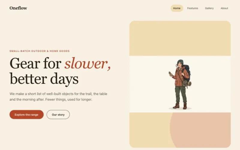
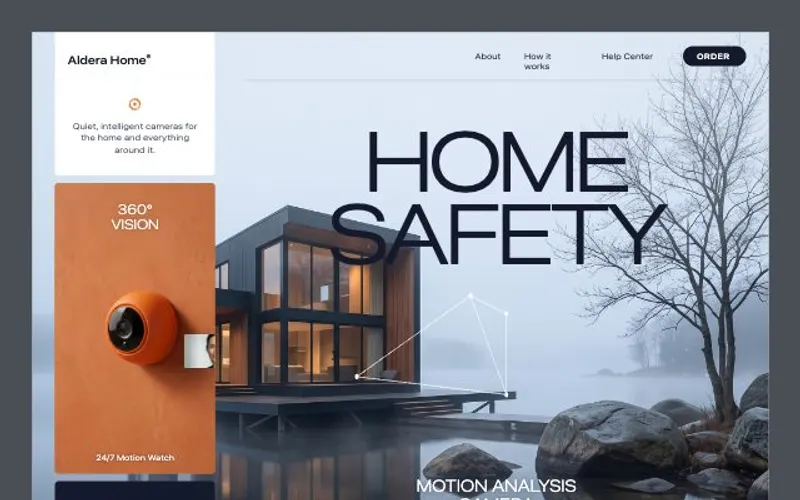 React websiteA React site from your brief, with a hero image and section pictures made for it.About 4 minutes
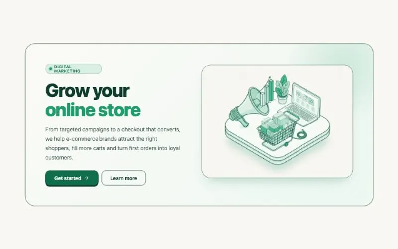 HTML componentOne self-contained UI component from your spec, with an illustration made for it.About 2 minutes
 Website with a CMSPages that read from content you can edit, with one shared design system.About 5 minutes